Website Deliverables and Importance of Inclusive Design
For my Capstone project I will be designing and creating a website for my client, Elena Markatos for her photography and videography business (you can see some of her content here by clicking the hyperlink: @lenamarkvids). Creating a website means I have to consider inclusive design, accessibility, and access through distribution (how I’m going to get the word out about it).
When considering designing and accessibility, a term to think about is “mismatched human interactions” which is described in the Microsoft Inclusive Design Toolkit. It explains that there is a “spectrum of permanent, temporary, and situational scenarios” when it comes to design, we need to be able to adapt our technologies to create a more user-friendly space. Realizing that the users that come into our spaces, like a website, are coming from different backgrounds and situations which may impact their experiences and usability within certain spaces. So when we design we need to consider where different experiences overlap and where these points of exclusion may occur and take the time to rectify that.
Inclusive Design and Accessibility in the Context of a Website
When creating a website some points of exclusion can occur when thinking about visibility. In thinking about how that correlates with mismatched human interactions have three categories to consider: permanent, temporary, and situational scenarios. In considering, inclusive design I looked through an Accessibility Guidelines article from Voxmedia.com where they discussed that when designing a website, contrast is a really big thing to consider implementing along with explicit labeling (meaning not relying on colors to denote the importance of something). For someone who is color blind which is a permanent situation, the sole use of colors does point out that importance hinders their access of using the website. By having explicit labeling and good contrast is not only beneficial to people who are color blind, but someone who has gotten their eyes dilated might have to change the brightness on their screens so having that stark contrast and labeling will help them know what things are what. For someone in a situational position like, in a room with bad lighting or wearing sunglasses having the labeling will help them be able to scan the page better. So these mismatched human experiences that we might not initially think of, end up becoming very pivotal influences in our designs and inner mechanisms of a project.
I added an image to help illustrate the impacts of contrast vs little to know contrast. To demonstrate how much that impacts a person’s ability to see and process an image.
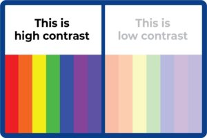
The image is taken from: visualdisplaysltd.com
Promoting the Website
After the website is complete my hope for getting the word out about it is to have my client create an Instagram post to let her followers know that this is a new platform to reach her on. Additionally, I am also hoping that she will add her website link to her bio on her accounts so that after watching a video or viewing a picture a follower will have easy access to her website.
My goal in promoting her website is to reach the athletes that follow her and for them to show it to their parents and friends. I am hoping that this platform will her expand her network and allow her more growth and opportunities.
Leave a Reply