As discussed in previous blog posts, technologies have inherent affordances and limitations. Sometimes, these limitations can exclude large portions of the population.
Our environment, including the things we interact with, should fit our needs. For example, if I’m a college student, I should be able to physically enter the classroom and sit at a desk. For someone in a wheelchair, this could be difficult. What if there was a class on the second floor in a building without an elevator? What if there isn’t a desk that is tall enough to fit the wheelchair? The environment has limitations that don’t match the needs of the student in a wheelchair, thereby excluding this student.
We can consider these exclusionary circumstances as “mismatches” between individuals and their environment. For my own capstone project, I want to minimize these instances of mismatched human interactions so as to include, and help, as much of the population as possible.
Points of exclusion
The limitations of the technology I’m using in my project influences the moments of exclusion. One of the points of exclusion I’m discussing directly relates to the limitations of Figma. Another point of exclusion relates to a misuse of Figma’s technology.
A primary concern, or point of exclusion, is that the app prototype may be inaccessible to blind individuals and those with severe visual impairments. There’s no capacity for screen reading within Figma; it’s intended as a tool primarily for visual design. There’s no ability to build these screen-reading capabilities into the prototype itself. The mismatch occurs when the app doesn’t have a way to provide people its features without the sense of sight.
Related to this point of concern is the general issue of text readability. It’s important that I choose colors with high enough contrast, so as to not exclude the large population of color-blind individuals. Figma allows for many different fonts and the use of any color, but I need to prioritize the functionality before its visual appearance. A mismatch occurs when the app doesn’t effectively communicate what it intends to for the population with differing eyesight.
Screen-reader
Design solutions
Addressing these points of exclusion would benefit from the “Solve For One, Extend to Many” principle of inclusive design, as described in Microsoft’s Inclusive Design Toolkit.
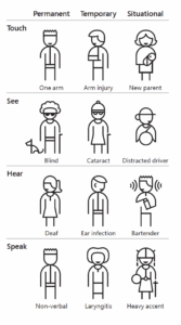
From Microsoft Inclusive Toolkit
Chart depicting permanent, temporary, and situational exclusion. It depicts icons for the sense of touch, sight, hearing, and speech. From Microsoft Inclusive Toolkit
The app’s incorporation of screen-reading capabilities will help more than those who are permanently blind. Individuals may have temporary or situational reasons that they aren’t able to view the app’s screen. For example, they may temporarily have their pupils dilated after an eye doctor’s appointment. They also may be situationally unable to see the screen in bright sunlight.
A design solution to this point of concern will need to work around the limitations of Figma. After my research, I found that many apps will actually focus on its compatibility with third-party screen-reading capabilities rather than directly including screen-reading within the app itself. Arctouch, a company that works in app development, published the “7 best practices for accessible app design.” Arctouch suggests providing screen reader annotations to streamline the order in which a screen reader communicates the information on a screen. I should be able to do this easily on Figma. It would demonstrate my commitment to accessibility, as well as relay my new knowledge about the app development process.
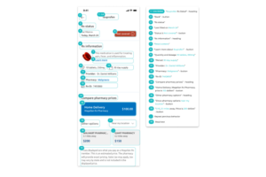
Arctouch’s screen reader annotations
The design solutions for general text readability are much simpler. This point of concern is only a concern if it’s something I forgot to do at the beginning of the design process. My existing familiarity with typography and color contrast should make it fairly easy to design with text readability in mind, though I can refer to sources like Design4Users to ensure that my knowledge is correct.
Distribution
Any type of mass distribution of this prototype falls somewhat outside of my concern. It’s not a developed app that I will distribute in the app store. Instead, the prototype’s target audience is employers reading my case study directly from my portfolio. This audience could also possibly extend to peers reading the case study on design platforms like Behance or Dribble.
The target audience influences how I want to be perceived in the case study. I want my case study and information about the app to be engaging. I also want the information to be accessible to any audience. My writing tends to be pretty wordy, but I should avoid the use of any complicated UX jargon while continuing to appear as an expert on the subject.
Leave a Reply