Over the course of my four years in the Communications Department, we have discussed visual design– whether for social media, websites, photography or brand books. More specifically, we have looked at how design can be composed in an inclusive and accessible way. For my capstone project, a magazine highlighting immersion and service programs at St. Joseph’s University, I will incorporate inclusive design principles throughout my final product.
Point of Exclusion
My final tangible product of my project will be three printed magazines, as well as an accessible pdf copy.
For the printed magazine, one point of exclusion are people who are blind. While I will be able to adhere to some visual impairments, my final print will not be inclusive to people who are blind, unless I am able to print on braille paper. However, the pdf version of my magazine will have alt text incorporated, so this allows the online version to serve more as an inclusive design for this community.
On the contrary, a point of exclusion for the pdf version of the magazine is anyone who may not have access to an electronic device. While my target audience is the St. Joseph’s community and there are technological resources available for students and faculty on campus (like having one loaned from IT or access to the desktops in the library) on a larger scale there may be people who will not be able to see a pdf version because they do not own a laptop. For example, one of the community partners I have worked with through one of the programs I am highlighting in my project (PSIP) only owns a flip phone– therefore downloading a pdf would not be available. Also older people who did not grow up in a technological era may not know how to download a pdf properly or may prefer a non-digital copy.
Design solutions to Exclusion Point
One thing I will be incorporating into my final design are accessible fonts, sizes and color contrast. While a printed magazine may not allow for alt text, like mentioned above, I can take into account other visual impairments for my final printed design. For example, I want to make sure my font sizes lean on the larger scale to take into account people who may be far sighted (meaning they have a harder time reading things up close). A larger text has also been found to provide a better user experience (allows readers to skim and are more willing to read). Also in terms of the Persona Spectrum, if a younger child picks up this magazine, it will be engaging for them as opposed to a lot of small text on a page.
The incorporation of images with captions is also very important for my final design. The captions not only provide context behind an image, but they can also be used as an additional learning tool. For example, if a person has a language-based learning disability they can associate the words of a caption with the image to help put into context the words. The same can be done for a younger child who may be looking at the magazine or a non-native English speaker.
Target audience and distribution outreach
While my larger target audience is the St. Joe’s community as a whole, realistically I will be working with Campus Ministry to distribute my work. My primary goal is to be able to give Campus Ministry this magazine (both the printed version and access to the pdf version) and have them distribute it to members of the community. Since my project focuses on the immersion programs on campus that are run through this department, it would make the most sense to make this a collaborative effort, especially since my project is people focused (all of my interviews are from members of this community). I think using them as a resource will allow me to get my work out there, and the message of the importance of immersion and service programs out there as well.
I can talk to the Campus Ministry social media manager and see if they would be interested in sharing my final product on the instagram account, as well as the specific instagram accounts associated with each of the programs I am highlighting (two example of the accounts to reach out to below).
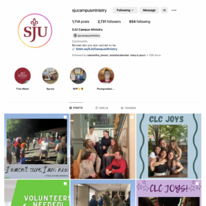
screenshot image of the “sjucampusministry” instagram home page.
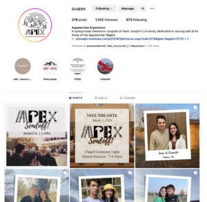
screenshot image of the “sjuapex” instagram account
Leave a Reply