Project Overview
For my project, I digitally created two book jacket covers with printed versions, photoshoots, and media graphics/campaigns to promote the novel. My mother, Judith Natelli McLaughlin, is a published author of children’s literature, middle-grade chapter books, and novels. While many of her books have been designed by outside artists depending on the publishing company she is contracted with, there are a few novels that have yet to be published. My goal was to take my mother’s writing and bring it to life using Procreate, Adobe Illustrator, and Adobe InDesign with her visions and my graphic design skills. Pursuing my love for graphic design while simultaneously working on a project that has so much meaning to me was such a rewarding capstone project.
Impacts
The impact I hope to make with this project is for the designs to live up to their expectations. That is, I truly want my mother’s stories to come alive through images on the front and back covers so an audience can truly get a feel for their love story messages. So often a book can fall flat if the design has nothing to do with the message it is trying to convey. I hope fans from different reading styles or genres are able to appreciate the classic love story novel and amplify my mother’s writing.
Solutions
Previous Experience
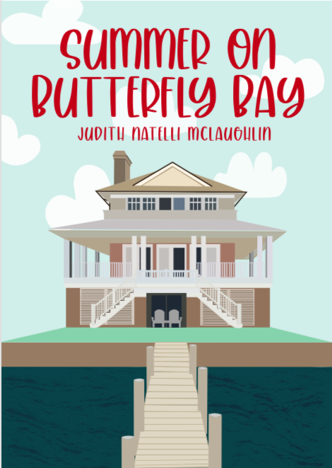
For a previous Advanced Design class with Dr. Sullivan, my final project was a design for my mother, Judith Natelli McLaughlin’s latest novel. Her novel titled Summer on Butterfly Bay captures a real, sweet, funny, and quirky romance story. Overall, I think this project really tested my design limits and is a great reflection of my abilities and style as a designer. I spent a very long time working out the details of this project because my mom is the most important client I have had this far. She was very satisfied with the outcome and hopefully, I get to design one of her book covers in real life one day!
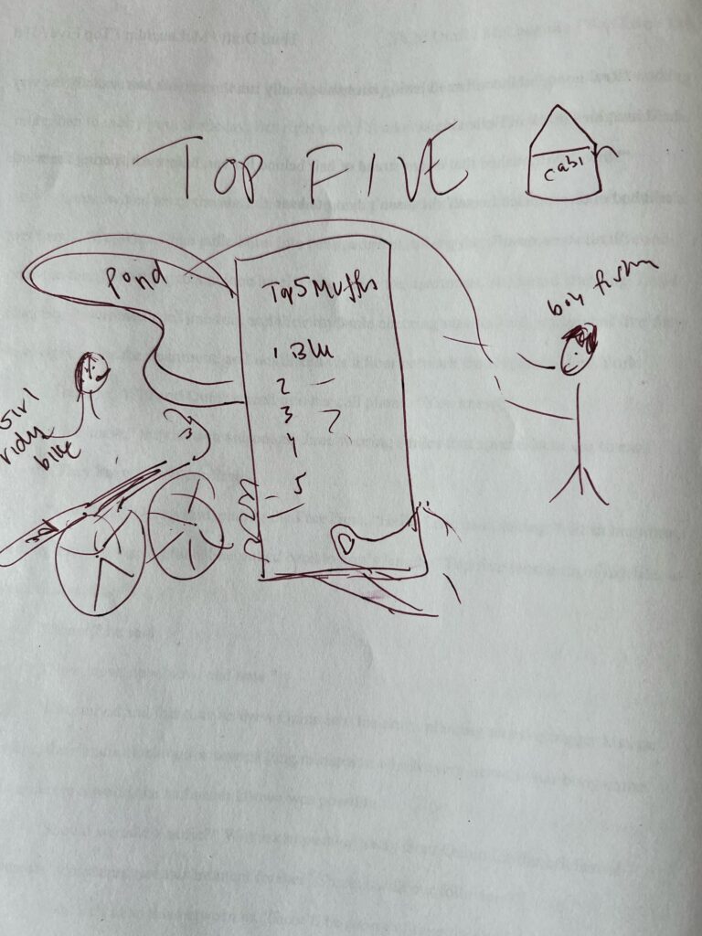
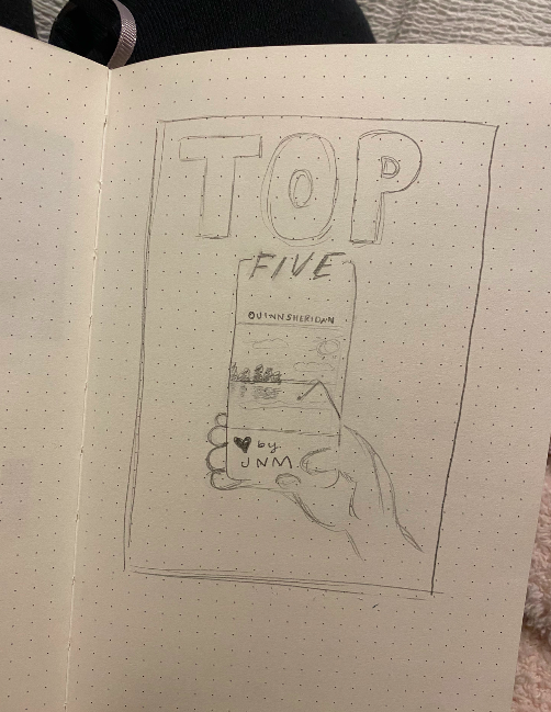
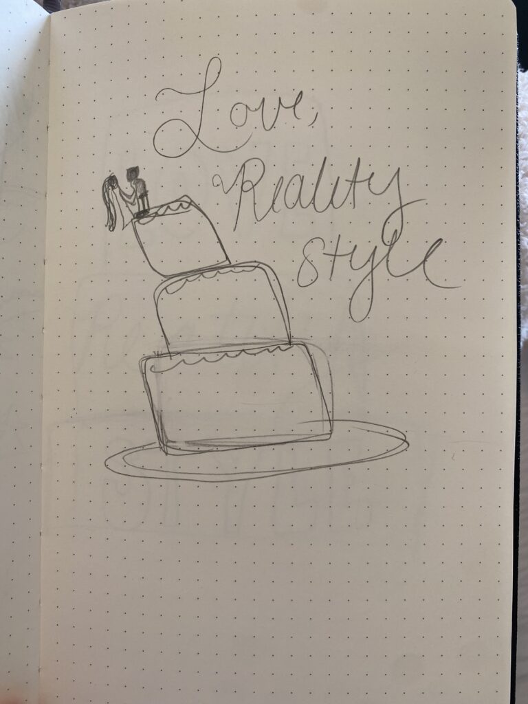
Sketches and Drafts
Color Palette
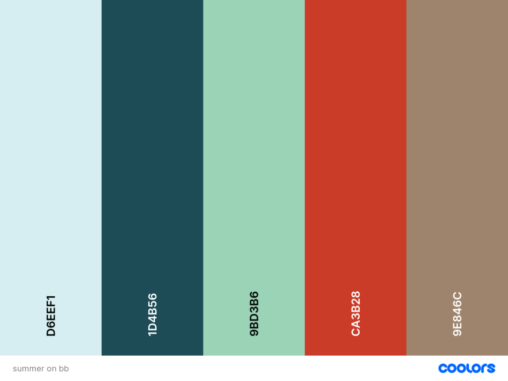
D6EEF1
1D4B56
9BD3B6
CA3B28
9E846C
Typography
Champagne & Limousines: Body Text
Header font
Project Challenges
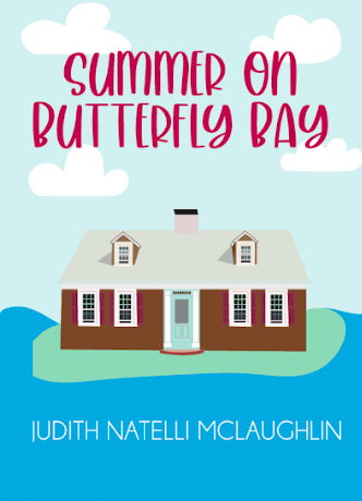
My design process was the most tedious for this project. I created many sketches and drafts for the perfect beach house on a bay. The first one, as you can see, was too much of a log cabin feel. I felt the colors of the house were too dark, and the background was too neon. After receiving feedback from peers and my professor, I decided to scrap the first design and stick with a lighter, brighter, and more modern beach house. I carefully crafted and selected colors for each shape until I was satisfied. Then for the details like the sky, water, and dock, I wanted to utilize the same sharp geometric shapes. I chose light blue, deep blue, and lighter browns to all complement each other. I think the final outline of the house has the perfect romantic yet beachy vibe to it.
The last design choices I made that were difficult were the font choices. I had trouble selecting a font that was not too childish but also spoke to a more adult reading crowd. The “beach house” font I chose received great feedback from peers. I wanted to utilize cranberry red to really stand out against the neutral colors from the house.
This Project’s Challenges
Using Procreate
Procreate poses constraints compared to the other Adobe software. Many professional graphic designers prefer Adobe Illustrator because it is more useful for branding projects, for example creating logos or brand sheets. With Procreate, you cannot create vectors as you can in Illustrator. Vectors allow a design to be scaled up or down or resized without losing quality. For graphics that need to be used for different purposes or mediums, Procreate is probably not the best option for a designer.
Using Print Services
Preparation Work
Inspiration
This project course challenged my vision as a designer yet solidified my appreciation for my favorite designers like Jade Purple Brown and Malika Favre. Using their techniques of minimal, two-dimensional designs and pop art meets op-art I was able to create my own style of geometric meets neutral. When creating my sketches for both novels, I was heavily influenced by Favre’s magazines she creates for The New Yorker and Brown’s campaigns for Sephora. These designers really honed in on the target audience I was designing for.
Research
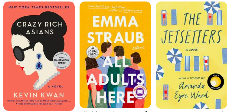
Research for this project included studying the covers, both e-book and paperback of romance novels with a twist of reality, like Evvie Drake Starts Over by Linda Holmes, Beach Read by Emily Henry, and Big Summer by Jennifer Weiner.
Research also included the examination of designers’ published books such as Alina Wheeler’s “Designing Brand Identity: An essential guide for the entire branding team” and Ellen Lupton’s “Thinking With Type: A critical guide for designers, writers, editors and students.” Wheeler highlighted the importance of a brand identity which must be a unique personality consistent with its mission and values. As a designer, it is crucial to have the same ideals of a brand identity because a designer is their own brand. Wheeler argues that this message begins with ideals such as authenticity, differentiation, and coherence. She discusses why these ideals are important for a designer to find their own identity and bring a brand to life. Wheeler uses examples of brands like Coca-Cola, Apple, and Target to demonstrate how they use these ideas for their strong brand identity.
Sketching
Primary Technologies
PROCREATE
Procreate is an app intended for illustrations on the iPad. This is the best software for an amateur graphic designer because the use of a pen on the iPad is so easy and there are many tutorials.
ADOBE ILLUSTRATOR
Illustrator is the best software for working with paths and manipulating text. This was the most useful for creating the book heading designs and formatting each design into proper book dimensions
ADOBE INDESIGN
Indesign is software for print and digital media which helped me create a layout for the full book jacket cover. The layouts they have on the app allowed me to seamlessly transfer my designs to paper
Project Considerations
Taking into account diversity and inclusive design
Readable Font
Color Pairings
My primary point of exclusion for my two deliverables is the color aspect which excludes people who are color blind. The designs created for the book covers needed to be inclusive for those who cannot see bright colors. Designing for this mismatched human interaction included both colors and symbols to convey the message of the novel. Additionally, I avoided color pairings which are difficult for the visually impaired to distinguish. What is most important when designing for color blindness is to place yourself in their shoes, in this case testing which colors are hard to see, to ensure no one is excluded
Creation Process
Gathering Inspiration
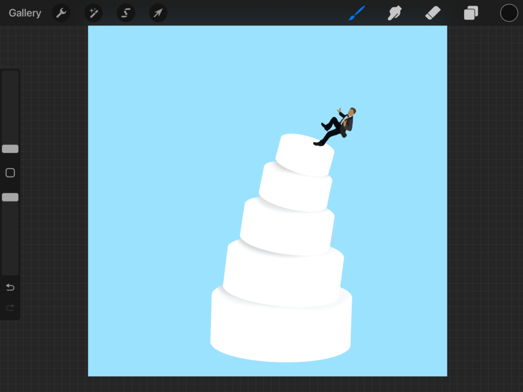
Bringing Sketches to Life
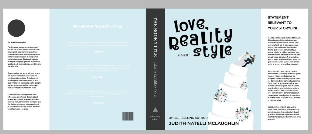
Incorporating Designs and Text Into the Book Jacket Template
Final Deliverables
Leave a Reply