Designing for the Visually Impaired
My primary point of exclusion for my two deliverables is the color aspect which excludes people who are color blind, The designs I make for the book covers need to be inclusive for those who cannot see bright colors. The designs I make will affect several groups of people who have mismatched human interactions. While I can’t design a book cover for blind people because I do not know how to use brail, I can design for other who experience different visual disabilities.
Colors and Symbols
To solve for this one mismatched human interaction, I will ensure that I use both colors and symbols. I will not rely solely on color to convey the message of the novel but ensure that the two are harmonious to gain a reader’s attention. Additionally, I will ensure that the colors I use are a minimal so the colors are accessible. What is most important when designing for color blindness is to be careful of using contrasting colors and hues which are difficult to distinguish.
Color Combinations to Avoid:
- Red and green
- Brown and green
- Yellow and white
- Yellow and light green
- Green and black
One way to prevent confusion with color combinations is to convert the design to grayscale. This will ensure the colors do not mesh into one gray blob, but have enough contrast for a color blind person to recognize shapes.

The difficulty of distinguishing shapes in black and white
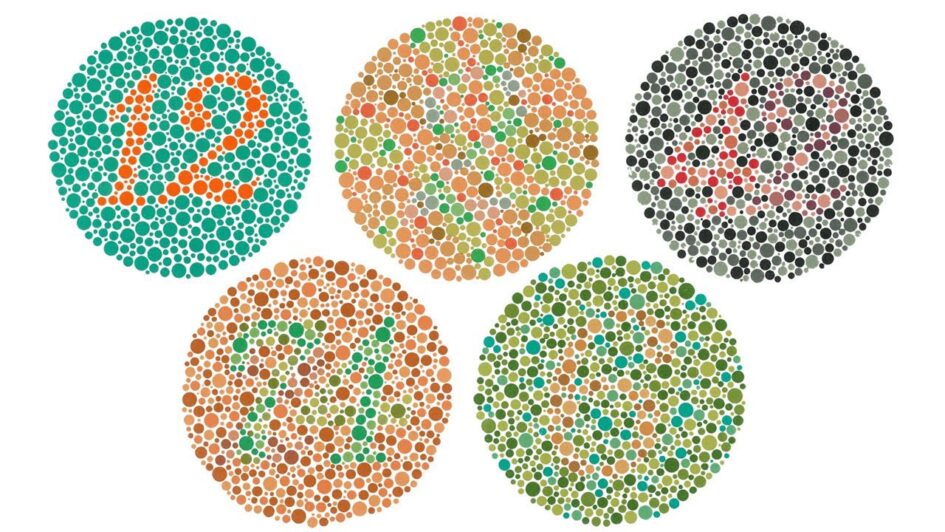
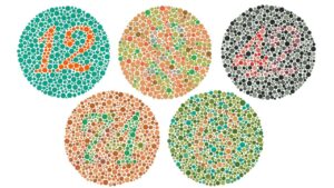
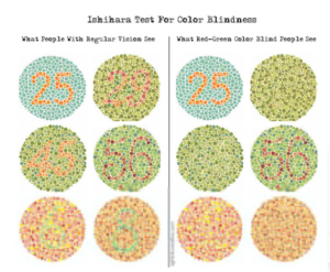
I think a great way to spread awareness about inclusive design for color blindness is to make others experience the same mismatched human interaction that others experience permanently. Often times I come across color blindness tests so that those who can see all color spectrums will experience what color blind do. This one test is called the Ishihara test and is a great simulation for those who do not understand what the disability entails. The frustration that ensues for visually abled people when looking at these designs is exactly how color blind experience non-inclusive designs. If more people were to place themselves in someone else’s shoes, inclusive design would be more ubiquitous.
March 12, 2022 at 4:29 pm
An excellent discussion of colorblindness, Maggie, and would have enjoyed a link to the test you mention.
You forgot to discuss your plans for distributing your work, however.
Bill